
What is Motion Design?
Motion Design is an Internal Editor plugin for broadcasting. You can use it for graphics creation, playout, and real-time data visualization for live television, news, weather, sports production, interstitial graphics, and a variety of other use cases that call for rapid design and animation workflows. The plugin resembles UMG in its user interface but contains features that are not possible within widgets, for example 3D parametric shapes and a dynamic material builder.
Enabling the Motion Design Plugins
To use Motion Design, you must first enable the required Motion Design and Storm Sync Motion Design Bridge plugins.

Create a Motion Design Scene
To create a Motion Design scene, create an empty level or choose from one of the existing level templates:

-
Go to the Toolbar > Motion Design, and click the button.

-
Go to Toolbar > Motion Design dropdown, and select Create Defaults.

-
Click Spawn to create the configured set of actors.


You can also use the Motion Design tools without changing the entire interface by switching to the Motion Design Mode in the Modes dropdown. You can activate this Mode by pressing the SHIFT+9 keys on your keyboard.

You can delete the scene later. To delete the scene, use the Deactivate Scene button in the same drop-down you’ve used earlier. You can also delete the Default Scene group manually.
Motion Design UI Overview
The Motion Design UI has multiple windows that you can use to spawn and manipulate objects.
The UI includes:
- The Motion Design Tool Box
- Palettes tabs
- Sequencer
- Operator Stack.
- Motion Design outliner.
- Motion Design Details panel.
- A new Viewport utility toolbar under the Viewport.
When a Motion Design Scene is activated, the Motion Design Tool Box opens by default.

In the screenshot above, the colored areas show the following features:
-
Motion Design Editor Panel Shortcuts
- Adds navigation selection to reduce the steps to access creative tools such as the Operator Stack, Remote Control, and Material Designer. It also serves as a central point of contact for the Transition Logic system.
-
Motion Design Toolbox
- Using this panel, you can place parametric 2D and 3D shapes, text, SVGs, cloners/effectors, and the Media Plate, as well as many other standard Unreal Engine actor types. The parametric shapes in the 2D and 3D categories are customized for Motion Design, while the Meshes category spawns a variety of standard meshes without customization options.
-
Viewport
- The default Viewport is still available in the Motion Design UI, with an additional option to zoom in and out on your canvas. To zoom, scroll your mouse wheel. When you select a camera, choose the option named Motion Design Viewport to use this behavior.
-
Tool Shortcuts
- This optional panel can house the Modifier and Transition Logic panels. You can open them through the Editor Panel Shortcuts bar (Section 1) by clicking the Remote Control and Material Designer buttons.
-
Motion Design Outliner
- The Motion Design Outliner is a customized version of the traditional Unreal Engine Outliner that adds additional functionality, such as filtering and nested groups. Nested groups have a variety of applications that include offsetting transforms by setting a single Null Actor as parent to several actors, and also setting visibility on several actors simultaneously. In addition, you can apply powerful modifiers to a single actor, or multiple actors simultaneously, that are nested under the Null Actor.
-
Sequencer
- The Sequencer panel has refinements in the Motion Design workflow where multiple sequences can be added and played individually or with logic applied by systems such as Transition Logic.
-
Viewport Utility Toolbar
- The utility toolbar offers access to a variety of features such as a mask visualization toggle, color picker, screenshot, color channel visualizer (useful for previewing the alpha channel), game mode toggle, bounding box visualization toggle, actor soloing, safe frame toggle, and various snapping tools.
-
Remote Control
- Every Motion Design level comes equipped with a linked remote control preset with no assets. In some situations where multiple levels are combined in the Rundown Tool, for example Transition Logic, their respective exposed remote control properties are combined and sorted.
Motion Design Viewport

In the Level Editor, Motion Design uses the standard Viewport, but adds extra parameters on the bottom:
-
Location controls for a selected object:
-
Resets to 0,0,0.
-
Sliders for the X, Y, and Z axes.
-
-
Toggle Mask Mode: Use this for work with Boolean ("mask") modifiers.
-
A section with various viewport visibility settings:
-
Game View. You can use this to toggle the visibility of all editor elements on or off.
-
Toggle Bounding Boxes.
-
Isolate Selected Actors.
-
Toggle Guides.
-
Viewport Overlay Visibility.
-
-
The snapping settings section. You can use this to toggle global snap, grid snap, screen snap, and actor snap.
-
The grid settings section. You can use this to toggle the grid, whether to always show the grid, and to adjust the slider for grid size.
Motion Design Outliner

These are the elements in the Motion Design Outliner:
-
Leftmost panel: Use this to set the filters for Motion Design.
-
You can click to scroll through the clickable filters.
-
You can also Select or Deselect All Quick Type Filters.
-
-
The Search bar.
-
The Group selected actors under a Null Actor button.
-
The View Options dropdown: Use it to configure what is displayed in the Motion Design Outliner, for example icons for Modifiers and Materials.
-
The Settings dropdown: Use it to configure the settings for the Motion Design Outliner hierarchy.
-
Editor and Runtime Visibility.
-
Lock: Toggles whether items can be translated in the Viewport.
Motion Design Tool Box (shapes and actor creation)

You can use the Motion Design Tool Box to create shapes and actors. The Tool Box lets you draw or drag and drop a variety of actors in the Viewport.
You can create the following:
-
2D shapes (2D Shape actors)
-
3D shapes (3D Shape actors)
-
Actors (Text, Cloner, Effector, Null, Spline)
-
SVGs
-
Meshes (static meshes)
-
Cameras (camera actors, camera rig actor, camera shake source actor, and post-process volume)
-
Lights
-
Media Plate
Color Picker

The Color Picker contains the following elements:
-
Color wheel: Use this to apply color to a selected Shape with a simple material.
-
Eye-dropper: Use this to select a color from any object in the Viewport.
-
RGB/HSV switch: Changes which set of values the sliders to the right of it control.
-
Lit/unlit toggle: Switches the Material for the selected actor between being lit and unlit.
-
The colors for the current theme.
-
A solid/linear gradient switch.
-
A button that swaps between Simple and Gradient colors.
-
A Themes button: Using this menu, you can edit the name of the current theme, create a new one, switch between themes, and delete a theme.
Viewport Information

The Viewport Information tab shows stats about the current Viewport:
-
Size: Measured in pixels.
-
Visible area: Displays the size of the zoomed-in area in pixels.
-
Center Offset: Displays how much the current center of the Viewport is offset from the true center.
-
Measured in pixels.
-
The offset can be negative or positive.
-
-
Cursor: Shows the position of the cursor in the Viewport.
-
Zoom: Shows the percentage (%) of the current zoom, when applicable.
Alignment

The Alignment tab shows the following:
-
Horizontal alignment: Use this to align multiple actors horizontally. Options are left, center, and right.
-
Vertical alignment: Use this to align multiple actors vertically.
-
Stack: Use this to align the depth of multiple actors. You can align to the front, back, or center.
-
Distribute: Use this to distribute the selected actors. Options are left to right, top to bottom, or front to back.
-
Rot(Actor): Use this to align the rotation of an actor with another actor.
-
Rot(Camera): Use this to align the rotation of actors with the camera.
-
Screen: Use this to fit the size and position of a selected actor into the current camera frustum.
Motion Design Sequencer

Sequencer is the key tool for creating, modifying, and previewing animations. Motion Design adds some additional tools and features to the regular Sequencer in Unreal Engine.
The UI includes:
-
Animations section: This section contains a list of all animations (level sequences embedded within the opened level/scene), as well as the Play, Take in, and Stop buttons. You can also add and search for animations.
-
The Selection tab: Shows properties of a selected key.
-
The Sequence tab: Shows the tags and Preview mark for the whole sequence. Also shows properties and settings for created Marks. For more information on Preview and Marks, see the Sequencer Editor documentation.
-
The Playback tab: Shows the settings for scheduled playback.
-
Sequencer itself, which has the following elements:
-
Binding and playback settings.
-
Sequence asset actions. You can save sequences and subsequences, browse to a sequence in the Content Browser, render your sequence, and open the director Blueprint for your sequence.
-
Sequence settings: Contains a menu with Actions, View options, and Playback options.
-
Keyframe settings: Settings for what is keyed, including auto-keying and auto-tracking settings. Also includes settings for what edits are allowed, and snapping settings.
-
FPS and time display settings.
-
Animation editing options: Curve editing and Fixes and stagger options.
-
The name of the currently-opened animation.
-
Lock: Toggles editing of the animation on and off.
-
Add Track: Use this button for adding various tracks.
-
Search and filters.
-
Current time and frame indicators.
-
List of sequences in the animation.
-
Timeline editor for the animation.
-
Motion Design Modifiers Stack

For the stack to be populated, you must have selected an actor. Applicable actors include Motion Designer shapes, text, and Null Actors.
The Modifiers Stack contains the following:
-
Search: Use this to search among the added modifiers.
-
The filter menu, where you can filter Modifiers by type. The available categories are:
-
Geometry
-
Layout
-
Rendering
-
Transform
-
-
The Add Modifiers button.
-
The Modifier Stack menu bar that applies to all modifiers in the stack, which has:
-
A toggle to display or hide the performance data for all modifiers.
-
A button to delete all modifiers.
-
A checkbox to enable or disable all modifiers.
-
A menu with 3 operations: Reset to Default, Expose Property, and Create Key. The Create Key option creates a keyframe for the Enable all modifiers checkbox state.
-
-
A list of individual modifiers with their respective parameters:
-
Delete the modifier.
-
A checkbox to Enable, Expose Property, or Disable the modifier.
-
The menu with Return to defaults and Create Keyframe.
-
Motion Design Animators Stack
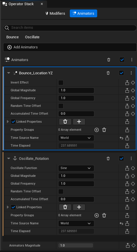
The Motion Design Animators Stack contains the following:
-
Search: Use this to search among the added animators.
-
The filter menu, where you can filter animators by type. Categories are Bounce, Time, and Wiggle.
-
The Add Animators button.
-
The Animators menu bar, which has:
-
A toggle to enable or disable all animators.
-
The Delete all Animators button.
-
-
The list of Animators with their individual parameters:
-
A button to delete the animator.
-
A checkbox to Enable or Disable the animator.
-
The menu with Return to defaults and Create Keyframe. The parameters include Animator Strength, Time Offset, the Animated Properties, and the Time Source.
-
Remote Control

Motion Design includes a linked Remote Control preset and contains parameters for actors, Modifiers, and Animators.
To open the Remote Control window, go to the Motion Design dropdown and select Remote Control.
The Remote Control UI includes:
-
The Save preset and Browse to the saved preset buttons.
-
A mode switch for Setup and Operation:
-
Setup mode shows the property itself. You can configure and assign logic to the property.
-
Operation mode shows the added Controllers.
-
-
Toggles for Protocols and Logic: Use these to enable configuration of Protocols and Logic for exposed properties.
-
Remote Control settings: Opens the Project Settings for Remote Control.
-
Log toggle: Use this to show or hide the control log for Remote Control.
-
The Web App button: Use this to open the Remote Control web app in your default browser.
-
On the left-hand side of the window, the Expose, Details, and Protocols tabs open the corresponding sections.
-
The Group section: Use this to organize exposed properties into groups.
-
The Properties section: Use this to expose actors and functions to Remote Control, and their exposed configurable properties.
Motion Design Broadcast
You can use Motion Design Broadcast to facilitate the output of Motion Design assets on assigned displays or other media outputs.
To open the Motion Design Broadcast:
-
Make sure the Motion Design plugin is enabled.
-
Unreal Editor, go to the UE Toolbar > the Motion Design dropdown > select Motion Design Broadcast.

The Motion Design Broadcast UI contains the following:
-
Buttons to Save Asset and Browse to the asset in the Content Browser.
-
Buttons to Start All Channels and Stop All Channels.
-
A toggle for turning Show Channel Preview on or off.
-
A Profiles dropdown: Use this to switch between different profiles, add new profiles, and delete profiles.
-
A Duplicate Profile button: Use this to create a copy of the currently selected profile.
-
Client/Server controls: Use these to start a client, launch a local server, and restart servers.
-
Channels controls, which contain the following:
-
A button to add a New Channel.
-
Channel status.
-
Channel name.
-
Options to pin the channel across all profiles, make the channel take up the entire area, and delete the channel.
-
List of output devices for a channel.
-
Channel preview.
-
-
Output Devices: Lists available media outputs that you can assign to the channels.
-
Details: Shows details about a selected output device assigned to a channel.