
This tutorial provides a set of step-by-step instructions about how to use Unreal Engine's Motion Design tools to create an animated 2D graphic that you can control in real time, causing it to enter the screen, leave the screen, and transform on screen. This workflow is a foundation you can build on to create more advanced and complex animations in both 2D and 3D using Motion Design.
Getting Started
This tutorial assumes you are familiar with the content of the Motion Design Quickstart. If you haven't read it already, start there. When you have enabled the required plugins, and reviewed the sections on creating a new level and the Motion Design UI, continue below.
There are two ways to continue with this tutorial, both equally valid.
-
Use Motion Design in an existing level.
-
Create a new level using the Motion Design template.
Use Motion Design in an Existing Level
Your first option for this tutorial is to open the Motion Design interface on an existing level by clicking the Motion Design button in the toolbar.

The Motion Design button in the toolbar.
You can also use the Motion Design tools without changing the entire interface by switching to the Motion Design Mode in the Modes dropdown. This Mode can also be opened using SHIFT+9 on your keyboard.

Motion Design in the Modes menu.
Populating an Empty Level with Default Elements in a Motion Design Scene
If you choose the first option above, to start from an empty level, you’ll need to activate Motion Design mode by clicking on the button at the top-middle of your screen. By default, when you create an empty new level in Unreal Engine, there are no lights, post-process volumes, or cameras.

The Motion Design button.
-
Select which recommended default actors you want to add to your empty level by clicking Create Defaults. This opens the Configure Default Scene Actors window with several options.

The Create Defaults button.
-
Select which Motion Design Default Scene Actors you want to add or replace in your scene and click Spawn. For this tutorial, use the default options.
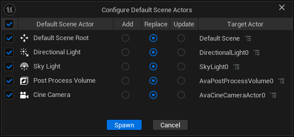
The Configure Default Scene Actors window.
The Viewport and Motion Design Outliner then both update with the options you selected.
Create a New Motion Design Level
For this tutorial, your second option is to create a new level using the Motion Design template.
Create a new level (File > New Level). In the prompt window, select what kind of level you want to create. The Motion Design template is used for 2D designs, while 3DMotion Graphics is used for 3D designs. This tutorial covers 2D design.
-
To follow the steps in this tutorial, select the Motion Design template, and click Create.

Select the Motion Design template.
Spawn Default Scene Actors
After creating the new level from the Motion Design template, you must configure and spawn your default scene actors.
-
Click the Create Defaults button to open the Configure Default Scene Actors window.
-
For this tutorial, you have to use the default options, so click Spawn to create the default scene actors.

The Configure Default Scene Actors window.
Creating an Animated 2D Graphic Using Motion Design
What You’ll Learn
This section of the tutorial has instructions for using the Motion Design interface features and tools you will use to create an animated 2D graphic. These include:
- Drawing and customizing 2D primitives.
- Customizing geometry using the Material Designer.
- Positioning content using Null Actors.
- Adding text.
- Constraining text to fit certain background sizes.
- Controlling text with Remote Control.
- Playing in a Sequencer animation, stopping it using the Sequencer mark system, then continuing from that mark to play the off-animation.
Initial Template Edits
After creating your new level, your UE user interface resembles the following image:

The Motion Design template initial state.
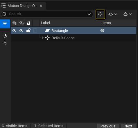
In this tutorial, you are going to create something new, so begin by deleting the graphical elements that spawn automatically with the template.
-
In the Motion Design Outliner, click on the Starter Content group
-
Press delete on your keyboard, and confirm you want to delete the children of the selected object in the dialogue window.
You should now see an empty Viewport similar to the following image.

The Motion Design template after deleting the Starter Content group.
The Viewport might display as a black screen. You can switch it to the checkerboard pattern using the View options in the lower-right of the Viewport.
You must set your canvas dimensions.
-
To do so, click the Camera button on the upper-left of your Viewport.
-
Select Ruler Override.
-
Use the Resolution settings to define the size of your canvas according to the requirements of your project.

Use Ruler Override to set the size of your canvas.
Shape Creation and Groups
You can create shapes using the Motion Design toolbox. If this panel is not open, you can access it by clicking the Mode dropdown, and selecting Motion Design.

Select Motion Design in the Mode dropdown.
You can choose from several shape options. For this tutorial, begin with a Rectangle.
-
Double-click the Rectangle to spawn one in the center of your canvas.

Double-click the Rectangle button to add a rectangle to your canvas.

Your newly-created rectangle should resemble this image.
You can customize the shape and properties of your new rectangle (such as slant and bevel) in the Details panel on the lower right side of the interface. You can also change the sizing by clicking and dragging the handles of the newly created shape.
Next, anchor your shape.
-
In the Details panel, select the Shape category.
-
Change the Horizontal Alignment to Left, and the Vertical Alignment to Center.

Changing the horizontal and vertical alignment.
You will eventually have other actors that will move around at the same time as a Group.
-
To create a Group, select the rectangle and press CTRL+G on your keyboard, or click the Group button found in the Motion Design Outliner.
The Group button.
This creates a null actor parent of the Rectangle actor.

The null actor parent of your Rectangle actor.
In the Details panel, you can experiment with changing the location of the null actor. Changing the null actor’s position does not affect the position of the rectangle actor.
-
Rename the rectangle to BG_Main by right-clicking it in the Motion Design Outliner.
-
Move the rectangle over to the left side of the screen so it is flush with the edge of the canvas.
-
You can do this using the rectangle geometry, or you can position the rectangle by using its null actor parent.
-
To do so, select that null actor, and rename it to L3_BG.
-
Using the parent, move the Location of the group in the Details panel.

Renaming the null actor.
-
Your canvas should now resemble the image below.

Moving the rectangle by moving the group.
You can hold down your middle mouse button to pan around the canvas. The shaded areas represent the _offscreen _region. In this tutorial, you are going to set up your graphic to slide offscreen, so keep the boundaries of your canvas in mind.
Next, size your rectangle:
-
Click on the BG_Main actor, and click the Shape button.
-
In the Motion Design Outlines, make sure that Size Type is set to Pixels. This is the first setting under Shapes.
-
Unlink your Pixel Size property by changing the Pixel Size from XY to Free.
-
Set the Pixel Size property to 1842 x 132.
You can size your shapes using either Unreal units or pixels. This walkthrough assumes you are using pixels, but all the features described here work for both.

Setting your unlinked Pixel Size property.
You are creating a lower-third graphic, so move the position of the entire group to where they typically live.
-
Select the null actor that parents BG_Main, and set the Y position to -160.

Setting the position of the null actor.
When everything is positioned, you Viewport should resemble the following image:

The results of your initial positioning.
Customizing the Graphic Using the Material Designer
Next, you will customize the lower third graphic to make it look more interesting than a simple gray box, using the Material Designer.
To customize the graphic:
-
Select the shape, and click on the Material button in the Details panel.
-
Set the Material Type to Material Designer.
-
Click the Edit with Material Designer button.
The Material Designer tab should appear in your Tool Parameters section. Your Viewport should now resemble the following image:

Setting up to use the Material Designer.
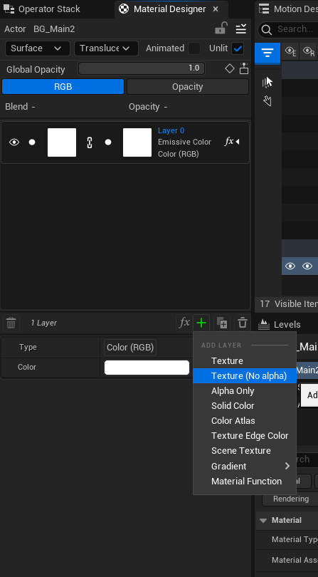
The Material Designer is Motion Design’s layer-based material creation tool. Similar to other layer-based tools, such as graphic editing or photo editing software, each layer has a fill, a mask channel, and an independent opacity value, as well as a full suite of blend modes.
Below is an overview of the Material Designer interface:

The Material Designer interface.
Interface Key
-
Switch between a surface or a post-process material.
-
Material type selector. The available options are:
- Opaque
- Masked
- Translucent
- Additive
- Modulate
-
Adjust the opacity of the entire layer stack.
-
Switch between adjusting the fill or the mask layer stack.
-
Adjust layer opacity, and change the layer’s blend mode.
-
Individual layer control for fill and mask.
- The chain icon determines whether to link the UVs of the fill and alpha texture.
- You can enable or disable either part by clicking on the white dot to the left of the layer thumbnail.
-
The Viewport Utility Toolbar contains the following tools:
- Layer FX, which you can use to apply a variety of material effects to a layer.
- Add a layer.
- Duplicate a layer.
- Delete a layer.
-
Layer settings, such as texture transforms and the ability to clamp a texture.
In the Material Designer interface image above, the fill of the layer (the checkerboard icon) is selected, and the image below displays some options to set the layer type. These include:
- Texture
- Solid Color
- Color Atlas
- Texture Edge Color
- Gradient
- Material Function

Layer type options.
-
For now you want a simple solid color, so select Solid Color.
-
Next, click the Color widget, and set the color in the popup menu.

Setting your color using the Color Picker.
-
Set your color to green using the following RGB values:
- R: 0.0
- G: 0.441406
- B: 0.030081
Adding a Pattern
Next, you will add a pattern by creating a new layer with the Add New Layer button found in the Viewport utility toolbar.

The Add New Layer button in the Viewport utility toolbar.
By default, it creates a texture. When you click on the dropdown, several options appear.
-
Select a standard linear gradient texture. In the example shown below, the texture is named 2.

Selecting a standard linear gradient texture.
Next, you need to do some rotation and scaling of the UVs to get the type of pattern you want for this walkthrough.
-
Disable the layer mask for this layer by toggling the mask off and unlinking the scale.

Toggle off the mask and unlink the scale.
You can also do this by creating a new layer and choosing Texture No Alpha.
-
Set the Properties for the texture to the following:
- Type: Texture
- Texture: 2
- Offset: 0.0, 0.0
- Rotation: 45.0
- Scale: 0.035, 0.035
- Pivot: 0.5, 0.5
- Mirror on X: disabled
- Mirror on Y: disabled
- Clamp Texture: disabled

Your new texture layer's properties.
-
Set the Blend for the gradient layer to Multiply as shown in the image below.

Blend layer set to Multiply.
Your graphic should now resemble the following image:

The initial pattern has a harsh gradient.
Next, you need to reduce how harsh the gradient is.
-
Set the Opacity (list item 5 on the interface overview above) to 0.11.

Reducing the opacity of the pattern softens the gradient.
To break up the pattern, fade it toward the left side of the bar.
-
Return to the layer settings and re-enable the layer mask, but keep the layer UV unlinked.
-
Add another linear gradient to the mask (you can use the same one).
-
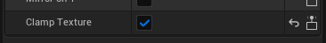
Clamp it using the clamp texture button in the texture parameters. This prevents it from repeating the texture.
-
Set the following properties on the alpha texture:
- Clamp Texture: True
- Offset: -0.566, 0.0
- Rotation: 220.0
- Scale: 3.0, 0.0
Your result should resemble the following image:

Your banner after adding a clamped linear gradient.
Next, you’ll round the edges and skew the shape slightly.
-
With your shape selected, click the Shape button.
-
Select the Right Slant property, and set the value to 18.00.
Beveling works in two ways, independent for each corner or uniformly. For this design, you’ll bevel the top right and bottom right corners.
-
Expand the options for Top Right and Bottom Right at the bottom of the Shape settings.
-
Set their values as follows:
- Type: Curve In
- Size: 13.0
- Subdivisions: 8

Your values should match those shown in this screenshot.
You can change the Viewport background from a checkerboard to solid black in the Viewport Utility Bar > RGB. This makes it easier to view your graphic.

Set the Viewport to a black background using the RGB setting.
-
To recreate the background bar, right-click on your L3_BG group and select duplicate. The bar’s color will be white, and the bar itself will be offset slightly.
-
Rename the actor to L3_BG_Bar_Offset.
-
Place it below your other bar in the Motion Design Outliner. You should see a bit of flickering, since there is nothing governing the priority of the two bars yet.
-
Select your L3_BG and L3_BG_Bar_Offset actors, and group them by pressing CTRL+G.
-
Right-click your new null actor at the root of your group and add a modifier called Translucent Priority.

Adding the Translucent Priority modifier.
The Translucent Priority modifier automatically sorts the render priority of translucent objects. The first item on the list renders on top of the next item. You can use this on a large nested group of actors, or on individuals. In this tutorial, you are going to use a translucent object at the top of your Motion Design Outliner, and let the Translucent Priority modifier regulate everything.
Move your graphics so they are offset instead of directly on top of each other.
- Offset the L3_BG_Bar_Offset so that the Z value is -170.0. The result should resemble the following images:


Your graphic and UI should look like this.
Adding Content in Motion Design
Next, you will add a logo and some text to the bar graphics you already created.
Adding Text to the Layout
To create some text, return to the Toolbox.
When working with text, remember that for a given text actor, all the characters will share the same settings. If you want individual characters to use different fonts, colors, sizing, and so on, you need to use separate text actors for each character that requires different settings.

The Motion Design user interface.
The Motion Design interface is fully described in the Motion Design Quick Start.
-
In the Toolbox (#2 in the image above, to the left of the Viewport), there is an Actors button. Click that button to show all of the different types of actors you can add to your design.
-
Double-click on the Text Actor to add it to the root level of your Motion Design Outliner.
-
Drag the new Text actor into the null actor group, so it appears in line with your background and your background bar offset.
-
Rename the actor by double-clicking it in your Motion Design Outliner, and call it Text_Line_1.
-
With your Text_Line_1 actor selected, press CTRL+G to group it.
-
Name the group Text_Lines so it is identifiable.
-
You want to have two text lines, so right-click and duplicate Text_Line_1, then rename the duplicate to Text_Line_2.
Changing the Font
You can set the font of the text by going into your Motion Design Outliner, selecting one of the text actors, and going into your Details panel. There are several buttons you can select; click on the one called Text.
In the Details panel at the bottom, with the Text button selected, you can update the content of the text line by changing the string in the text field. You can also change your font and typeface.
-
Change the font to Roboto.
-
Change the typeface to Italic.
-
Shift the position of Line 2 down so the lines do not overlap.

Setting the font and typeface for your text actor.
Notice the text is covered by the green bar. You can correct this by using the Translucent Sort Priority modifier that you set up previously. However, to use that modifier your actor must use a translucent material type.
-
Select one of your text actors, then click on the Style button in the Details panel. You’ll see that the Translucency style is set to None, which means the Translucent Sort Priority modifier can't sort it as it is not translucent.
-
Change the style to Translucent.
-
Repeat this for the other text actor, and you will now see the text appearing on top of the bar.
-
Selecting the Text_Lines null actor at the root.
-
Click the General button in the Details panel.
-
Move the entire group down by shifting the null actor Location down, until it overlaps with the bar.
-
Select each text line, and set the scale to 0.45 in the transform settings.

General text actor settings.
Text Layout Tools
You now need to use the Text Layout Tools.
-
With the text selected, click on the Layout button in the Details panel.

Text layout settings.
In this section, you can set a variety of common text properties. You are going to modify a few of them now. Begin with the Alignment options.
-
You want to keep the horizontal alignment of your text left-justified, so do not change that option.
-
Change the vertical alignment of each text line to be centered, so select the third option in the second row.
Kerning, Line Spacing, and Word Spacing are also all available here, but you aren’t going to use those now.
-
Manually position Text_Line1 and Text_Line2 apart, so that they aren’t right on top of each other.
You can also use the Grid Arrange modifier to position the text actors.
-
Use the Max Width setting to ensure your text stays confined within the layout.
-
Set the value so the text is retained within the borders of your graphics.
You can reduce guessing the required Max Width value by typing a random number until you run off the edge of your layout. Then, you can refine the value until it restricts the text to within your desired bounds.

Setting the Max Width value for your text layout.
Here is a comparison of before and after setting the Max Width value to 1550 and adjusting the text position.


Before and after adjusting your text layout.
Make sure to leave space to the left of your bar for when you add the logo and show name.
Grid Arrange Modifier
As mentioned above, another way to space out these two lines of text is to use the Grid Arrange modifier. To test it out:
-
Select the Text_Lines root actor and then right-click it.
-
Navigate to the modifiers and select Grid Arrange.
-
You will see the following interface:

The Grid Arrange modifier settings for your text line actors.
The two settings that you need to learn to use here are the Count and Spread.
- Set the Count to (1, 2) and the Spread to (0.0, 31.0).
When you added the Grid Arrange modifier, the Motion Design Outliner changed. Both the eyeball icons for the editor and runtime visibility for the second actor were disabled. This is because the count for both width and height was set to 1, so these settings were no longer required to be visible.

Text line actor arrangement after changing the Count and Spread settings.
This change arranged the text actors, spaced them out, and enabled their visibility in the Details panel. For more dynamic layouts, this sort of logic is necessary, but even for a comparatively more static layout like this tutorial project, it’s an effective tool.
You can disable a modifier by clicking the checkmark on either the entire modifier stack or on the individual modifier. This is useful for experimenting and debugging.
Adding a Logo to the Layout
You will revisit the Material Designer here, but before you do, you need to add a piece of geometry to work with.
-
From the Toolbox, add a rectangle from the 2D shapes.
-
Double-click the rectangle, select it in your Motion Design Outliner, and create a group by pressing CTRL+G on your keyboard.
-
Name the group Show_ID, and name the newly-created rectangle Logo.
-
Add two text actors to the group, and name them Banner_Line1 and Banner_Line2. You are going to use these for part of your banner.
-
Select the whole Show_ID group, and drag it above the Text_Lines group in your Motion Design Outliner.
Your Motion Design Outliner should now resemble the following image:

The Motion Design Outliner after adding the logo actor and banner line text actors.
With those elements in place, you can start building your logo. Click on the logo actor you just added and open the Material Designer. As a refresher, this means:
-
Select the actor.
-
Click the Material button.
-
Set the Material Type to Material Designer. Your Material Designer tab now populates to the left of your Motion Design Outliner.
- This time, you don’t need to unlink the fill and mask. You will apply a texture here that has both channels, so it automatically uses them.
-
Click the dropdown in the properties, and browse to the UE_Logo_icon-only asset in the EDC_Content folder. You can also drag and drop the texture onto your canvas.
Your result should resemble this image:

Adding the UE_Logo_icon-only asset to the canvas.
-
Clamp the texture in the Material Designer property list for that layer.
Enable the Clamp Texture setting.
You can always check the key and fill of your level by selecting Alpha using the Viewport Utility Toolbar:

Changing the Viewport to display the Alpha channel.
The Viewport changes to show you a view that resembles this image:

The Viewport displaying the Alpha channel
Remember to switch the Viewport back to RGB before continuing to work.
Since the Material Designer defaults to translucent materials, you can move the logo into your layout, and it will be sorted correctly as long as it is near the top of the list.
-
Configure the Banner_Line1 and Banner_Line2 text actors to have the same settings as the two text line actors you created previously.
-
Select each banner line actor, and set them to Translucent with an Opacity of 1.0:

Banner line text actor style settings.
-
Move the whole Show_ID group, using either the handles in the Viewport or by using Transform settings under General in the Details panel, so that the logo is on the left side of your graphic. Your interim result will need further adjustment, and should resemble the following image:

Work in progress with the banner icon and text needing transforms.
-
Click on your logo to select it.
If you find selecting a logo is difficult, you might not have Translucent Selection enabled. Enable it by pressing the T key on your keyboard, and try selecting it again.
You can resize the logo in two ways:
- Scaling the actual size by using the actor Transform settings under General in the Details panel.
- Changing the scale value in the Material Designer with Clamp Texture enabled.
For now, resize it by using the actor Transform settings. You will use the Material Designer transforms method later to scale the UVs for animating.
-
In the Details panel, set the scale for all three axes to 0.55.

Scaling the logo actor.
Next, you will work on your banner title.
-
Select Banner_Line1, and set the text to "The Daily".
-
Set the layout settings for both Banner_Line1 and Banner_Line2 to the following:
- Alignment
- Horizontal: Left Justified
- Vertical: Centered
- Kerning, Line Spacing, and Word Spacing: 0
- Max Width, Max Height, Scale Proportionally: Disabled

Banner line text actor layout settings.
- Alignment
You don't need the Max Width setting for the banner line text actors, because when you are working with the completed project you will not be able to edit them.
-
Scale and reposition your text until your result resembles the following image:

Banner icon and text actor after transforms.
-
Change the font of your text to something you like. The examples shown use Roboto Italic for both. Under the Typeface option you can choose between different font weights.

Adjusting the font and typeface.
Viewport Features
The bottom right of the Viewport has several features. For the purposes of this tutorial, only two are relevant: Viewport Snapping and Viewport Guides.

The bottom right of the Viewport, showing the icons for the features you can access.
Viewport Snapping

Viewport snapping options.
To access Viewport snapping options, right-click on the magnet icon. Each of these is a toggle, and can be configured as you prefer.
- For this example, right-click on the magnet icon and select Screen & Guide.
Left-clicking on the magnet icon disables whichever options you’ve selected.
The grid-and-magnet icon immediately to the right provides the option to snap to a grid of a specified size.

Specifying a grid size for Viewport snapping.
Viewport Guides
To ensure everything is lined up the way you want, you can use Unreal Engine’s built-in guides system. If you click and drag from the rulers at the top and left side of your viewport, you can draw out guides that are useful when you want extra precision.
Drag out two guides to line up with the Unreal Engine logo. To remove a guide, double-click it.

Using guidelines to arrange actors.
If you have a complex set of guides you want to save, click Camera in the Viewport, then select Guide Presets > Save As.

Saving your guide preset.
When you have a saved guide preset, additional options appear under Guide Presets. These are:
- Active: Identifies which saved preset you are currently using.
- Save: Save your current preset.
- Save As: Save your current preset under a new name.
- Reload: Reloads your current preset settings.
- You can select a saved guide preset to populate it to the Viewport.

The additional options available after you have saved a guide preset.
At this point, your project should resemble this image:

The banner, text actors, and logo at this point in the tutorial.
Save your work before continuing.
Background Bar Visual Details
Before continuing, try adding a new texture to the background bar on your own, so that it is not a simple white bar, but instead has some additional detail to make it more visually interesting.
After you are done, read through the steps below to see how you did in comparison. If you had trouble, follow the instructions to modify your background bar.
-
Select your white bar background, and click the Material button in the Details panel.
-
Set the Material Type to Material Designer.
-
Click Edit with Material Designer.

The Edit with Material Designer button.
-
Add a texture with no alpha channel.
Using the Add Layer menu to add a texture with no alpha channel.
-
Change the blend mode to Multiply and set your texture controls as follows:
- Select the texture dropdown, and choose the linear gradient asset labeled 2.
- Enable Clamp Texture.
- Adjust your UV settings for Offset, Rotation, and Scale.
- Set Offset to -1.415.
- Set Rotation to -90.
- Set Scale so that the X value is 0.029, and the Y value is 1.0.
- Set the opacity to .87.

The settings for the new texture with no alpha channel.
Your result should resemble the following image:

The drop shadow result.
A drop shadow like this doesn’t need to be texture gradient-based, and can use normal scene lighting with a real-time shadow. It involves using duplicate geometry for the green backplate, and setting it to be opaque rather than translucent (translucent materials are incapable of casting shadows). Feel free to experiment!
Animating your Design
Your objective is now to take what you’ve created, have it slide into view from offscreen, and stop in the center. You will also set up the off-animation, where the graphic will retract back off-screen to the left.
Animate the Banner Graphic
First, select the entire graphic, and set a keyframe where you want it to land.
-
Click on the root null actor. In this example, UE automatically named it Null Actor1.

The banner graphic null actor.
-
In the Sequencer panel, advance the playhead to frame 30.
-
Set a keyframe by pressing the S key on your keyboard, or by clicking the diamond icon to the right of the Location in the Details panel General settings.

The set keyframe diamond icon.
-
Click the keyframe to make a new selection section appear.

Your new selection section after placing and clicking a keyframe.
-
In Sequencer, click the pen icon to the left of the Magnet icon to find and enable Auto-key. This feature automatically places a keyframe any time you change the value of the track.

The Auto-key feature in the menu.
-
Drag your playhead back to frame 0, and expand your Null Actor1 Transform Location settings in Sequencer:

Null actor Transform Location settings.
-
Change your keyframe Y value for the root null actor to -1500. This takes the entire graphic off-screen, and creates a keyframe at that value, because you enabled Auto-key. You can also set that keyframe by changing the value in the Motion Design Outliner, and clicking the keyframe diamond icon.
-
To have your animation ease into frame, click on the keyframe at the beginning of the move (frame 0 in this case). You should see a graph view in your selection section on the right.

Graph view of your selection.
-
Clicking the Selection drop down menu shows you several options that will save you time when animating. For this example, select Cubic.


The Cubic option in the Selection menu.
You can click the Play button in Sequencer to see how each option looks.
-
Next, add a pause to this animation so that you can start working on animating the off-animation. Move the playhead to frame 30, then right-click on it and select Add Mark. This creates a mark labeled A. You can change the label by right-clicking the A and changing the Label property. For now, A is fine as the label.

Add a mark.

Your new mark.
-
Click the button to open the Sequence tab, on the right side of the Sequencer panel.

The Sequence tab.
-
Click the Role dropdown, and select Stop.
Marks can have several roles. These include:
- Mark (default, no function)
- Stop
- Pause
- Jump
- Reverse
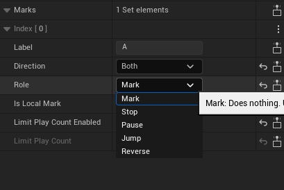
Mark role options.
Choosing Stop means the animation will stop at that point, until you choose to continue and start the off-animation you're going to make.
-
Create another keyframe at the current Y location that you already have at frame 50. You can also press ENTER as a shortcut when the track is selected. You can also create the keyframe for your Sequence by clicking the add keyframe button associated with the Y setting in the null actor Transform Location settings, as shown below:

The add keyframe button.
-
Click the first keyframe, press and hold the ALT key, then drag the keyframe to approximately frame 90. This duplicates the original (offscreen) keyframe, and creates a suitable off-animation.
-
Right-click the playhead at frame 70, then select Set End Time to remove the unnecessary sections of the timeline.
Animate the Logo
With the bar now animated, your next step is to animate the Unreal Engine logo you created, using the Material Designer.
Animating properties using the Material Designer is no different than animating any other property; as long as you have a diamond icon next to the property, the workflow is almost identical.
-
Start by selecting the Logo actor from the Motion Design Outliner.You’re going to give it a scale-down in addition to a fade-in using the layer opacity.

Using opacity and scale to create an animation.
-
Keyframe the opacity.
- Move the Sequencer playhead to frame 8.
- Set the Opacity value to 0.
- Click the keyframe diamond icon and your sequencer will move to that point. Give yourself about 20 frames for the reveal animation.

Keyframing the opacity.
The images below show the beginning and end values for your move animation. The key changes from beginning to end are as follows:
- Opacity value 0.0 -> Opacity value 1.0
- Scale
- X value 2.786 -> X value 1.0
- Y value 2.786 -> Y value 1.0


Beginning and end values for your move animation.
Your next task is animating the logo mask using the opacity tab.

Using the opacity tab again.
-
Assign a texture for masking at the level of the entire material (rather than masking only a layer) from this tab.

Assign a tearing texture to the material.
By adding this tearing texture to the material, no matter what you do in the underlying RGB tab, the texture will mask it.
What you can do here is limited only by your creativity, and we encourage experimenting with all of the ways you can use keyframes - there’s a huge variety!
Rigging your Layout and Content with Remote Control
Now that you have designed and animated your graphic, the next step is rigging it to take advantage of Remote Control. Remote Control provides a way for you to expose a variety of properties so you can customize them from a central location.
Remote Control also offers a powerful system called Behaviors. Behaviors provide for logic operations that offer you even more rigging power. Do you want to switch between different styles (comprising several properties) by controlling the value of a single integer? The combination of Remote Control and Behaviors can help you do so.
-
Begin by selecting the Remote Control tab. You can find it right next to the Sequencer tab.

Select the Remote Control tab.
-
You can also open it from the main menu under Window > Remote Control Panel.

Open the Remote Control tab from the main menu.
Every Motion Design level comes equipped with a pre-linked remote control preset. When you open the panel, your interface will resemble the following image:

The Remote Control panel in its initial state.
The Remote Control panel provides a lot of powerful and potentially-complex functionality, but for this use case you only need to use the essential features. You are going to:
- Control your two text lines.
- Using a single control, change the text of the show’s branding, the show logo, and the color of the bar itself.
Begin with the two text lines.
- To Expose a Property to Remote Control, go into your Motion Design Outliner and select the Text_Line_1 actor.
- When you look at the Details panel, you will see joystick icons. Navigate to the property settings buttons and click Text.
These joystick icons are widespread - Remote Control can control many parts of your project.

Joystick icons indicate a setting you can control using the Remote Control feature.
Your interface should now resemble the following image. Under the Properties column, your text string is exposed and you can edit it. Whatever change you make to the text string is immediately reflected in your viewport.

Exposed text strings in the Properties column.
The Property ID column on the left will be important once you control the branding on the left side. Property ID is a way to group up your controls that is useful when you have many exposed properties you want to organize. It is a part of the workflow when you want to set multiple properties from a single source, which this tutorial covers later.
The column to the right of Properties is where you can add Controllers to your setup. Controllers provide a simpler, operator-friendly interface.
-
To create a controller for the property you exposed, click and drag the group into the Controller column. Your interface should resemble the following image:

Create a controller for an exposed property.
Organizing your controllers is important for making your rigging accessible to an operator, and labeling your fields can help you do so. You can edit the Controller ID and Description fields by double-clicking them, then entering a new alphanumeric string as the value. By default, the Controller ID value is Text.
-
Change the Controller ID label to B100.
-
Set the Description to Text - Line 1.
Your interface should now resemble the following image:

After changing the Controller ID and Description text fields.
- Repeat the process for your Line 2 text.
Alternatively, instead of repeating the entire process, you can achieve the same result by a more complex but also more efficient means.
- Delete the Text_Line_2 actor.
- Copy and paste the Text_Line_1 actor.
- Rename the duplicate actor to Text_Line_2.
By doing so, a Tracker Component is added to the duplicate actor. This process duplicated the actor, and exposed the same properties to Remote Control. The only additional steps to this workflow you need to do are:
- Check your grid modifier is still spacing out the lines appropriately.
- Drag the new actor's exposed group from your Properties panel into your Controller column.
Your interface should resemble the following image:

Your interface after creating a second Text_Line actor.
- Test out your remote-controlled properties by changing their values in your Controller Column under the Input field.
If everything is configured correctly, the effects of your changes will show immediately. Notice that when you dragged your text from the Properties panel into the Controller, a Bind Behavior was added (you can see it in the above screenshot). There are several of these Behaviors - all of which we designed to offer additional automation and logic to simplify your workflow.
With that in mind, you will rig up the logic that will drive the items on the left side of the bar, using the Conditional Behavior in tandem with the Property ID system.
- Start by exposing the properties you will need to work with. Using the same process you just learned with the Text_Line actors, expose the following properties:
The logo
-
Click on the logo actor in your Motion Design Outliner and open the Material Designer.

The button to open the Material Designer associated with your logo.
-
Clicking the Remote Control button associated with the logo texture adds a texture controller to your Remote Control panel.
-
In your Remote Control Properties column, highlight the newly exposed texture. Set your property ID (currently listed as None) to 100.Logo.
100 is the most important part here, but you can use a period to further describe the property in case you have multiple images or colors that you want to label and control.
The Show Title text
-
Expose the text fields that comprise The Daily and Hotfix separately.
-
Assign those to property IDs 100.ShowTitleLine1 and 100.ShowTitleLine2 respectively. Your interface should resemble the following image:

Assigning property IDs to the text fields.
The Background Bar Color
-
Click on your BG_Main actor, or select it in the Motion Design Outliner. If it didn’t automatically open, go into the Material Designer that you already set up.
-
Click on the green bottom layer, and expand your expose options by clicking the More (⋮) menu.
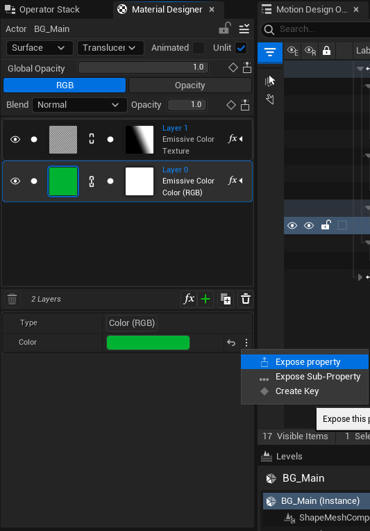
The More menu options.
-
Expose the property, and assign it the property ID 100.Background.
Your interface should now resemble this image:

Your interface after exposing all the properties.
Now that your exposed properties are set up, the next part is to set up controlling several properties from one integer.
-
Under the Controller column, click on the plus sign on the left side, and select Integer.

Controller value options.
-
Label the Controller ID A100 for organization purposes.
-
Use the drag handle to the left of the controller ID field for each line to reorder your list manually.
-
Change the description for this property to read 0 = Show 1 | 1=Show 2.
-
Select the controller, and click on the plus sign in the Behavior column to manually add a behavior.
-
Select Conditional, and click on the property.

Add the Conditional Behavior.
With this selected, you can choose how to evaluate what you are going to add, but leave it set to =.
-
Click the plus button next to Actions.

Click the plus button at the top of the Actions column to add a new action.
-
From the menu, select Add specific ID action > ID: 100, as shown in the following image:

Select a specific ID action using ID: 100.
This collects all the properties with the 100 prefix and adds them all to the Actions column at the same time.

All the properties with the 100 prefix collected together in the Actions column.
Now, when you set that value to 0 in the Remote Control controller, it sets all of those values to whichever values you’ve set up for the selected properties. In this case, make sure you set it so that 0 = the Unreal Logo and the green bar.
-
Right-click on the group of properties, and choose Duplicate.
-
Double-click the Condition field of the duplicate group, and set the value to 1.
Here’s an example of something you can make using this workflow.

A completed example using the workflow described here.
Once this is properly set up, when you press 0, you will see the first banner theme, and when you press 1, you will see the other banner theme.
Using Storm Sync to Package Your Content
Exporting a .spak File
You can export your content into a lightweight .spak file. This is useful in situations where you’re backing up content without source control, or handing a colleague a full scene and all of its dependent files. Here is how to use this feature for your project.
-
Open the level that you’ve been working on. The example shown here is called
Demo_Working_Project. -
Right-click in the viewport and select Export:
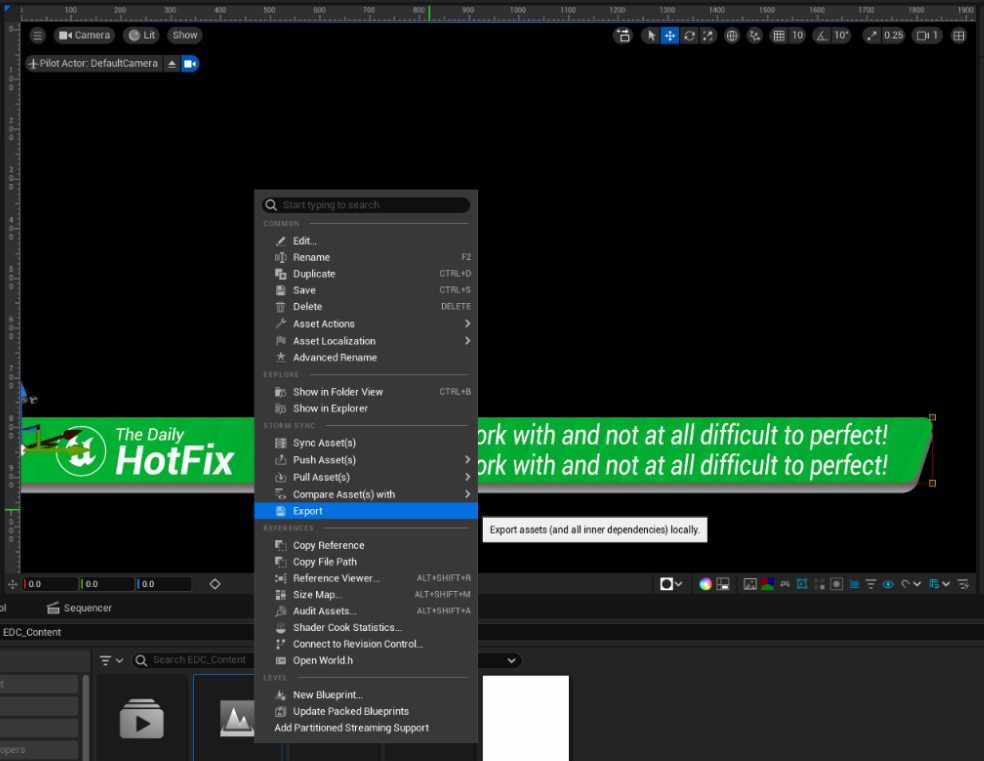
Exporting your project to a .spak file.
UE then auto-collects and displays a full list of required files.

An auto-collected list of files for export.
-
Click on Next. This sends you to an export option screen where you can name your
.spakfile.
Name your exported file.
-
Name your file, and click Finish. You should see a message on the lower right that shows you where your file was saved.
Importing a .spak File
To import your .spak file, drag the file from the directory where you exported it and drop it into your Content Browser. You will be presented with a screen to verify the contents of the file before importing it. If UE detects changes between the files in the .spak file and what you have in your project, it lets you know, and imports what has changed. If it’s a brand new set of assets, that change list shows everything.
Here is an example of what the list will look like if you don’t already have any of the files:

The changelist you will see when importing a project from a .spak file.
Click Import to populate your Content Browser with the necessary files.
Rundown Tool UI Overview
Before starting this section, we strongly recommend a two-monitor setup. This will mean you can use one monitor to operate as an output monitor, while the other functions as a place to operate your graphics. Without a two-monitor setup, you will have difficulty following this tutorial.
With everything set up, all that remains is for you to play out your customized content using the Rundown tool.
To begin, create a new Rundown by right-clicking in your Content Browser, and selecting Motion Design > Motion Design Rundown.

Create a new Motion Design Rundown.
You can use the Rundown tool to add your levels to a central location and create pages that provide a way for you to rapidly generate content to be played out live. The following workflow will serve as a surface-level, fully local overview of the tool for simple playback.
With the right setup, you can have multiple instances of UE running on a network, where a discoverable instance of UE hosting the project you want to play can be controlled by the UE instance running the Rundown and the Rundown’s preview capability.

The Motion Design Rundown interface.
Here are some aspects of the Rundown tool interface that are key to this tutorial:
-
Template List: All imported levels are located here, and you can import them by dragging the level from the Content Browser.
-
Playback Controls: You can control selected pages from this panel. Taking in/out, continuing, and taking the next item on the Rundown can all be done here. These playback controls refer strictly to actually taking the graphic to air. You can preview before taking by using the Page Preview, which is addressed in item 6.
-
Page List: Dragging any item from the Template List results in creating a page. You can take pages to specific, designated channels. For the purpose of this tutorial, leave it on Channel_0.
-
Page Details: You can set individual page properties here, such as a text line, integer value, and so on. You can also modify the Page ID and page name from here.
-
Toolbar: The toolbar contains several commonly-used controls, such as saving, adding/removing a new template or page, or setting broadcast settings. There is also a quick access button on the right to Start All Channels and effectively go "on air."
-
Page Preview: Similar to the Playback Controls referenced above, operators can preview the content of a selected page before taking the graphic to air. You can also use Preview Next to review the complete list of pages.
Using the Rundown Tool
Begin by adding your level to the Rundown.
-
Click Add Template on the top row, or drag your level directly into the template list.
-
Double-click the Preview In button to see what you’re working with.
Your result should resemble the following image:

Previewing your page in the Rundown tool.
Previewing doesn’t mean that you have played your graphic out live on air. You’ll notice that the Take In / Take Out buttons are still grayed out (list item 2 in the interface description).
That is because you now need to drag that template into your Page List.
-
Drag the template into your Page List, then click Continue on the page preview panel. If everything is functioning correctly, you should see the off-animation that you created animate the graphic away.
-
With your page selected in your Rundown, modify some of the page details.
-
Change the B100 and B200 values to say something other than the default text.
-
Click Preview In again.
-
Your result should resemble the following image:

Modifying your page's text in the preview.
-
Right-click your 0001 page and select Duplicate. You are going to make a variation of that page to further experiment with the controls.
-
On the duplicate page, set the value of your A100 property in your page details to 1 instead of 0. With the logic you have in place, the result of using Preview In for your graphic should resemble the following image:

Creating a duplicate page.
Now that you have your pages set up and functioning, briefly explore the output of your graphic. For simplicity, this tutorial will focus on a single machine operation where operation and output occur on the same engine.
-
Open your Broadcast Editor by clicking the Broadcast button:

Open the Broadcast Editor.
The Broadcast window now appears:

The Broadcast window.
Under the Output Devices list on the right side, you should see the displays that you have available
As mentioned previously, you need more than one display.
-
Click the display that you want to output to, and drag it into the Channel_0 viewport. Your result should resemble the following image:

The Channel_0 viewport after you drag in your output display.
-
With your output set up, click the Start All Channels button.

The Start All Channels button.
The screen that you designated for that channel will turn black and show no further activity until you go back to your Rundown.
-
For the purposes of this tutorial, designate the monitor that just went black your Program display, and designate the other monitor your Rundown display.
-
You are currently Live. Look at your Rundown display, and click Preview In on one of your pages. It will play out on the preview viewport. Assuming the preview looks correct, click Take In on the Rundown display. Your previously dark Program display now shows your lower third graphic.
The following image is a composite showing what the display on your two monitors should resemble:

Your Rundown display on the left, and your Program display on the right.
-
While you are actively outputting to your Program display, select your second page from your Rundown and Preview In that page.

Preview In the Rundown display without changing the Program display.
You are now previewing the next page while the Live page is actively displaying.
-
Click Continue here:

The Continue button.
The graphic on your Program display animates the off-animation, and leaves the display.
- With your 002 page selected, click Take In and your blue lower third graphic will animate to move on to the Program display.
Now that your graphics are set up, play around with the options here to learn how to operate your graphics.
You can call up pages from your page list by using your number pad. CTRL+Enter activates Preview In for that page, and Shift+Enter activates Take In to send that page to your Program display. Hover over the other buttons to see their respective shortcuts.